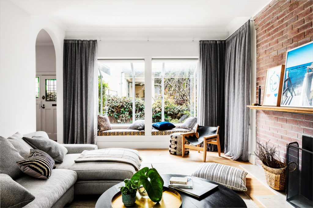
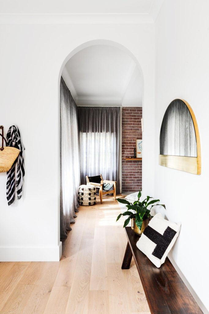
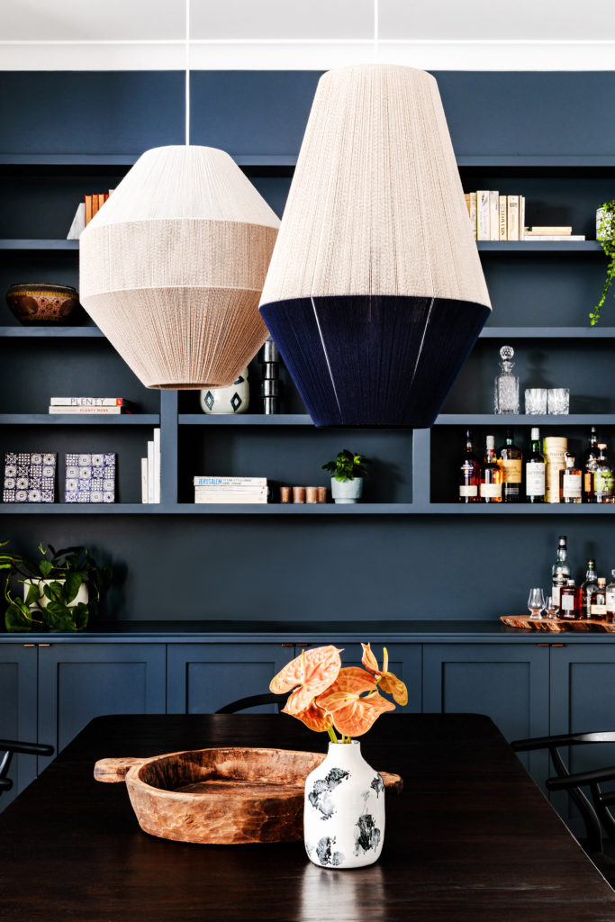
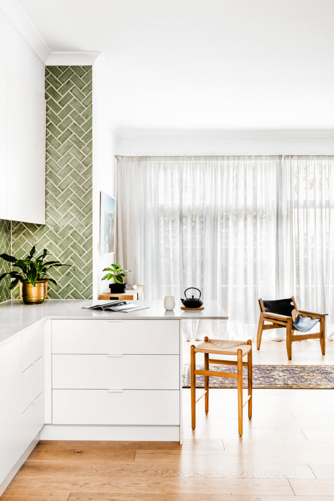
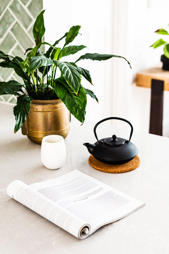
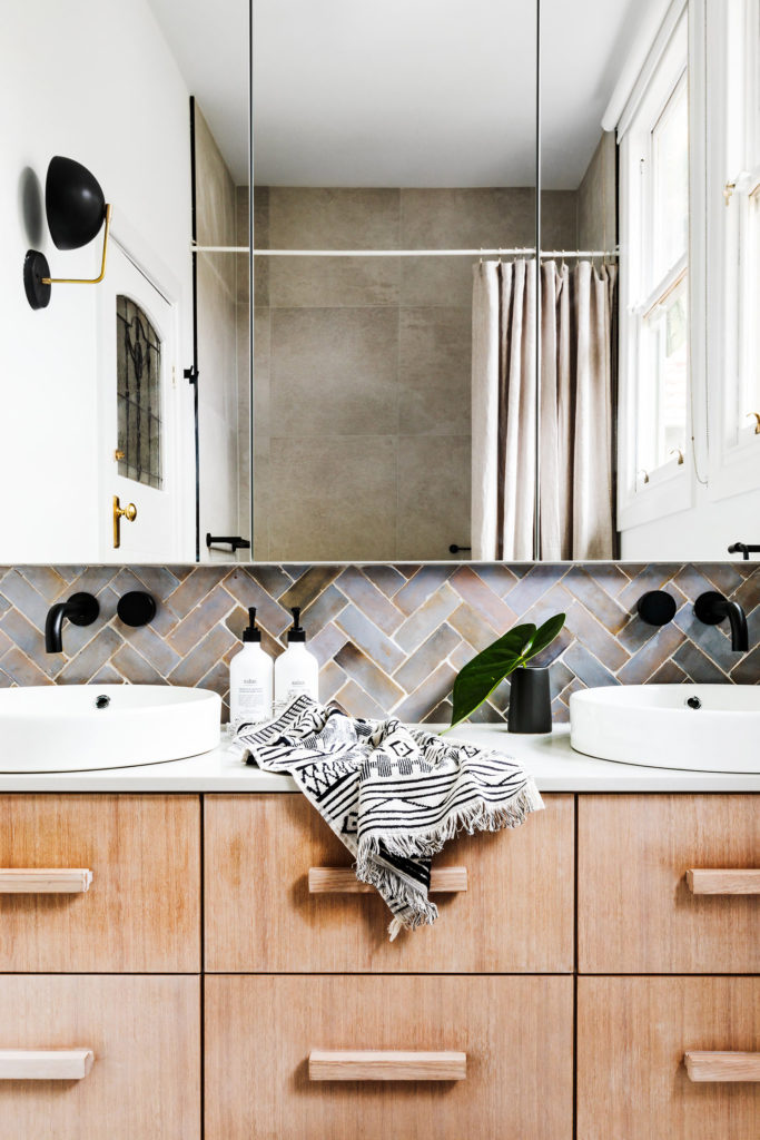
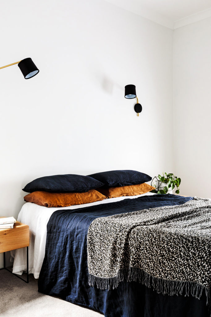
“Clean and comfortable” is how I would describe this renovated, 1920s home. Though minimally accessorized, the design is far from austere. Well-chosen pieces — woven light pendants, assorted baskets, carved bowls — ooze warmth and give the home a global vibe. The design also incorporates natural tones to complement a dominant palette of white and gray. Overall, the home is a lesson in creating a comfortably modern interior within a century-old shell.
Photography by Amelia Starwick via Homes to Love


